GARMIN WEARABLES

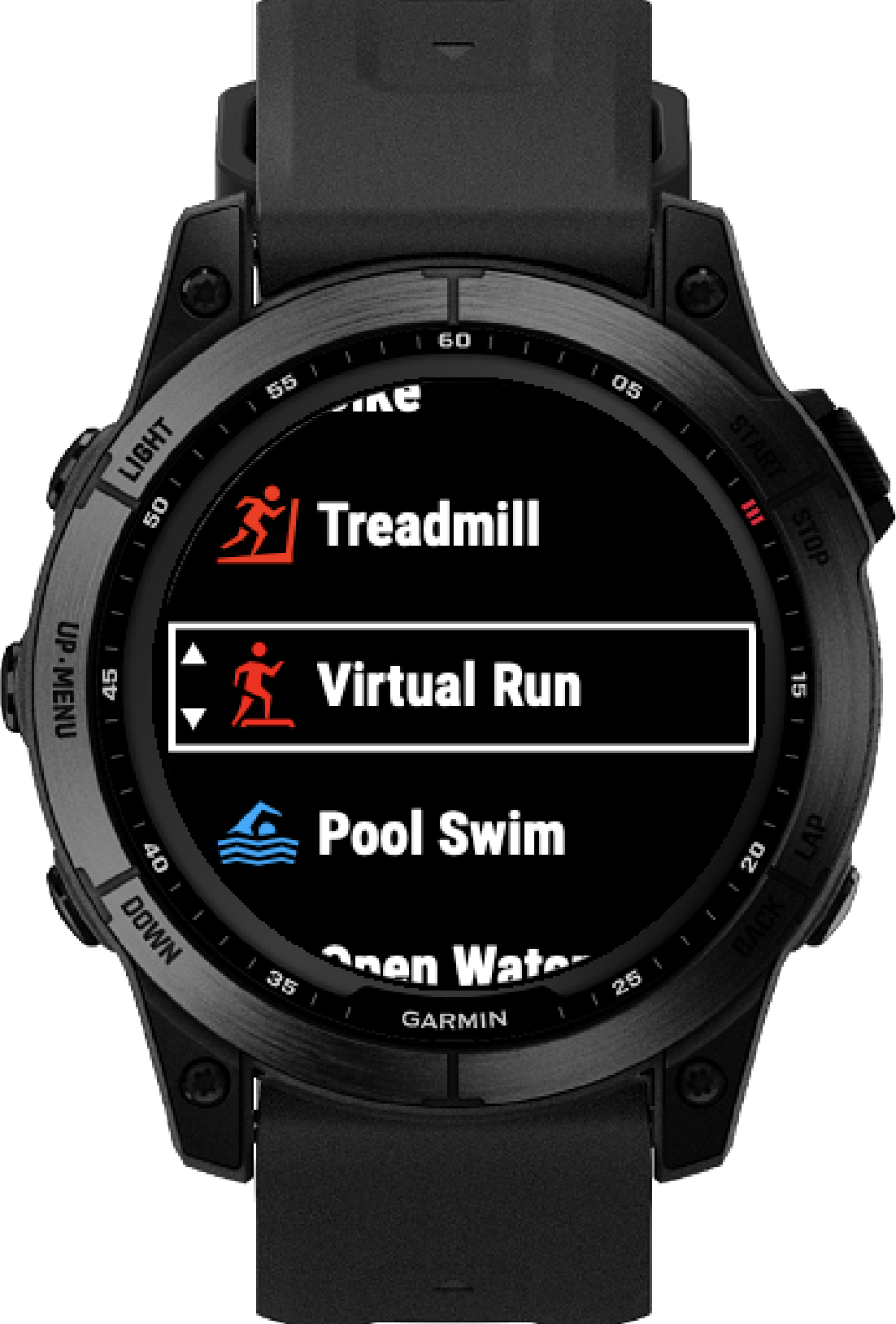
During my time on Garmin's Fitness UX team, I designed new wearable features, conducted usability research, built interactive prototypes, and collaborated with product managers and software engineers across multiple product lines. My work ranged from smartwatch interfaces and onboarding experiences to user testing for unreleased products and helping migrate the team's design system from Sketch to Figma.
UX Designer
Figma
Mural
AI Products
IBM Products
Aug 2022- Now

Garmin is a GPS navigation and wearable technology company in a variety of industries. I worked in the Fitness Segment, where I worked across the following products and had the following impact:
Product
Forerunner
Garmin Connect
Bounce
Garmin Clipboard
Women's Health
Design System
My Contribution
Designed wearable features and watch face interactions
Redesigned onboarding and learning experiences
Conducted usability testing with children and parents
Designed and tested coaching workflows
Researched menstrual health education experiences
Migrated Sketch libraries into Figma
My Role:
Designing a smartwatch feature that recommends clothing based on weather conditions.
Overview
Garmin wanted to explore new ways of helping runners prepare for workouts before leaving the house. While Garmin watches already provided weather information, users still needed to interpret that data and decide what clothing would be appropriate.Our opportunity was to transform weather data into simple, actionable recommendations by designing a feature that suggests what to wear based on current conditions.
My Role
I led the UX design process from concept through engineer handoff. My responsibilities included: (1) Conducting user research with Garmin users, (2) Exploring design concepts and interaction patterns, (3) Creating wireframes and high-fidelity interfacesIterating designs based on stakeholder feedback, (4) Presenting concepts to product managers, (5) Preparing final Figma files for engineering implementation
The Challenge
Runners often check multiple sources before exercising, including weather apps, temperature forecasts, and personal experience, to determine what clothing is appropriate. The challenge was to design a smartwatch experience that could answer a simple question:
"What should I wear today?"
The experience needed to feel quick, glanceable, and easy to understand within the constraints of a wearable interface.
The Design Process
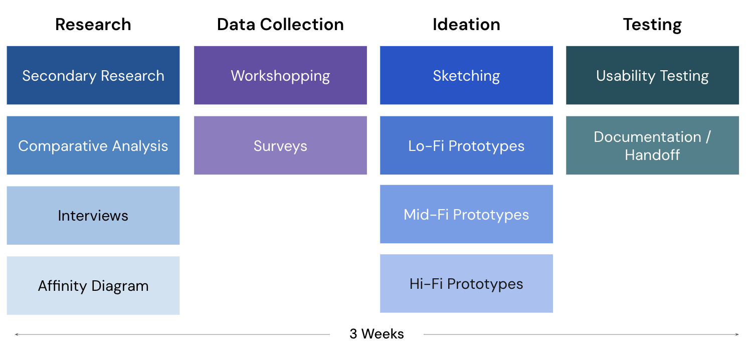
Research
To understand how runners decide what to wear before exercising, I conducted user research focused on current behaviors and decision-making. Before designing any concepts, I wanted to understand whether this feature would actually provide value to runners and how they currently decide what to wear before a run.
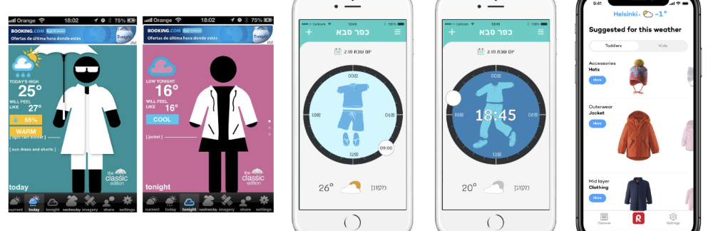
I started with secondary research around weather, running apparel, and existing fitness products. I also looked at how other wearable companies approached weather recommendations and found that most platforms focused on reporting the forecast rather than providing personalized clothing suggestions.
Survey
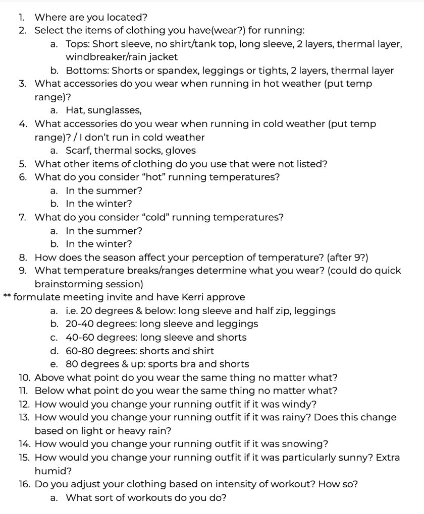
I decided to start with a survey distributed to around 100 runners to gather feedback from Garmin users, asking questions such as:
The survey helped validate that dressing appropriately for changing weather conditions was a common pain point, especially during seasonal transitions and unpredictable Midwest weather. Many runners described checking multiple weather apps before deciding what to wear, while others relied on trial and error based on previous runs. These findings helped establish that there was an opportunity for Garmin to simplify a repetitive decision that users make before nearly every workout.
Workshop
To go even deeper into the brains of runners when making decisions on clothing attire, I held a brainstorming session or workshop to collect more data and interview users.I had around 30 participants, all of which attended in person in the office in Kansas.
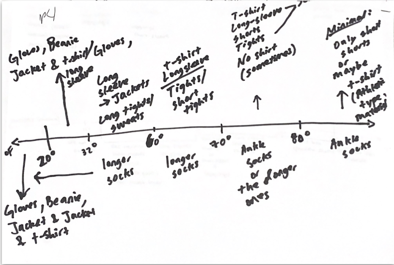
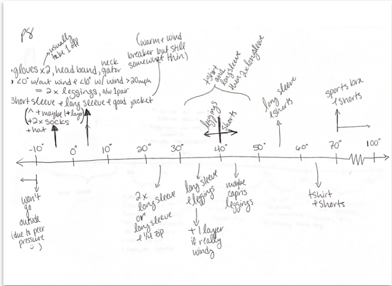
I facilitated a line graph activity, where I had them draw a graph on a sheet of paper and mark the different temperature ranges and what they would wear inbetween each of those temperatures.
For example, in the image on the left below, the person’s graph shows that they wear the same outfit between 32 and 60 degrees (long sleeve, long tights). In the graphic to the right, the person changes their attire choices between 30-40 degrees, 40-50, and 50-60.
Design Considerations
From this research (which also included comparative analysis, affinity diagramming, and more methods not listed here, I was able to create a list of design considerations that was inspired from this exploration. This list would be taken into the ideation and prototyping phases. Some things for consider in the designs were:
Design System
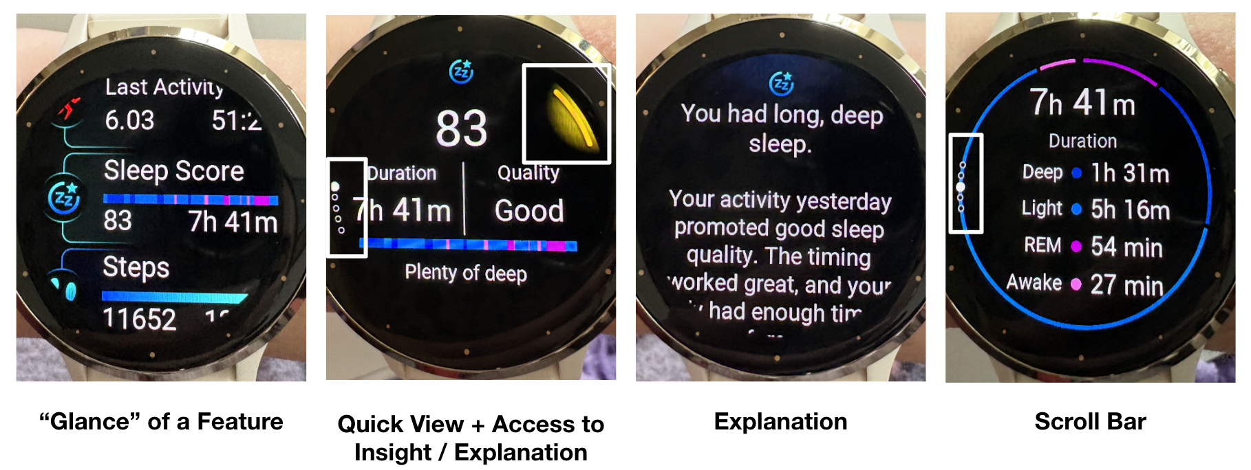
An important part of this project, and in order to understand my designs, I must explain the design system I was working within. These designs are within the constraints of a circular watch interface and the existing design system of these watches There were 2 types of watches, touch screen watches and button watches. We were designing the same features for both but they had different systems since scrolling with a finger is different than using a button to move within the screen.
This is an example of a touchscreen feature, where you are seen a high level bit of info (called a glance), which you can click into and see a quick high level view. You can scroll through pages that will give you a more in depth view, or you can press the top right button to get an explanation on the information (here you are seeing a description about your sleep). This design system limited the possibilities of how this feature could lok and work.
Ideation, Lo-Fis, Mid-Fis and Testing
Ideation and Lo-Fidelity Prototypes
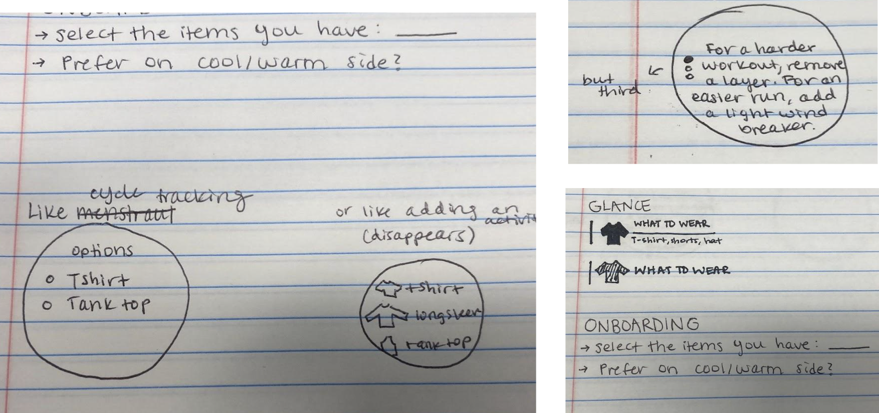
With the requirements defined, I began sketching multiple concepts to explore different ways of presenting clothing recommendations. Early concepts varied in: Where the feature would live within the watch experience, the level of detail shown, visual hierarchy, iconography, recommendation wording and user interaction flow.
After selecting the strongest concepts, I translated sketches into low fidelity wireframes. The goal during this phase was validating the overall workflow. I focused on:
Mid-Fidelity Prototypes
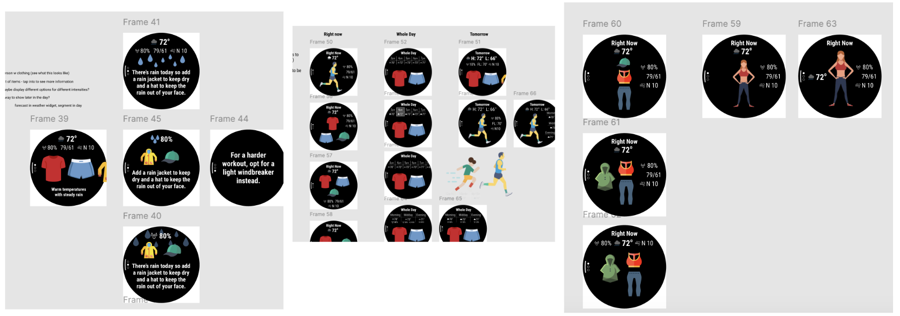
After validating the overall workflow, I created mid fidelity designs that introduced Garmin's visual language while continuing to refine usability. As the designs became more realistic, I worked closely with engineers to review technical constraints and confirm that proposed interactions could be implemented on the device. This stage focused on:
Usability and A/B Testing
I used the same 30 participants from the data collection / workshop to conduct usability testing and A/B testing of my mid-fidelity screens. At this point, I had a lot of iterations of visuals, icons, layouts and follows. I conducted A/B testing to try out a few versions of the same screen, mostly centered around how to display the “outfit” that we are suggesting to the user - show a runner icon wearing the appropriate clothing? Show a few clothing items? What information would they need to see on this screen, normal temperature, wind, feels like temp? Any abnormal weather?
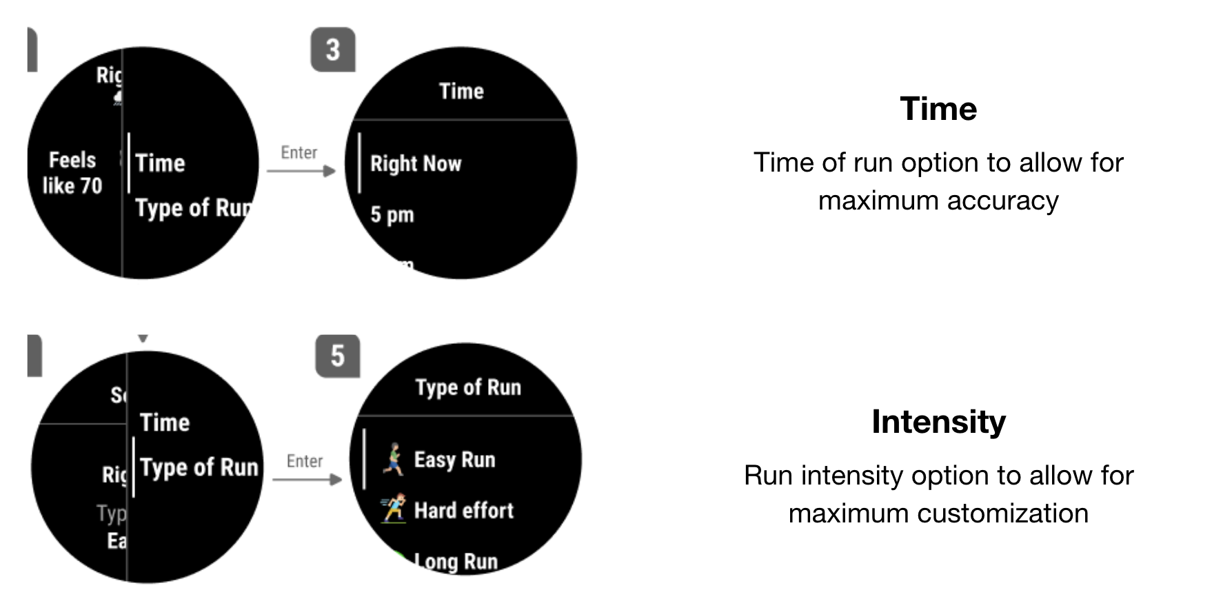
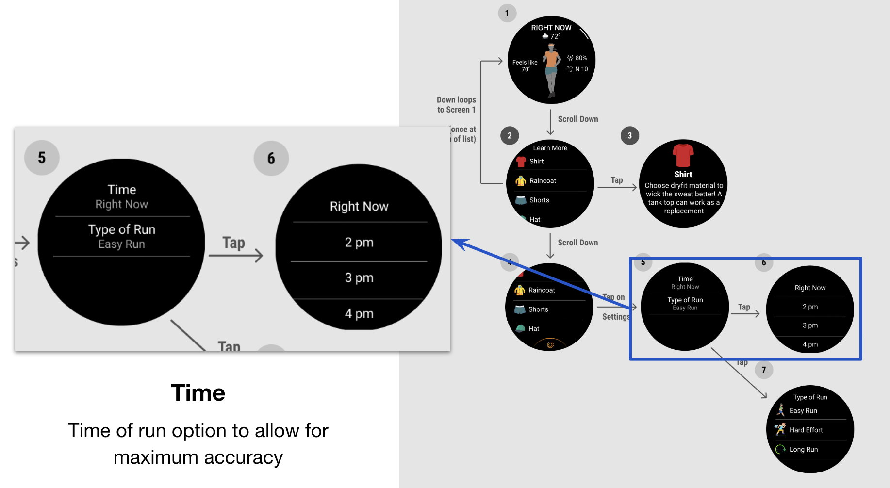
I also conducted usability testing, and one main takeaway that came up again and again was … What if I am planning ahead for a run later in the day? They wanted a way to get a recommendation for after work or after school. So that led to another iteration before the final design.
Final Designs
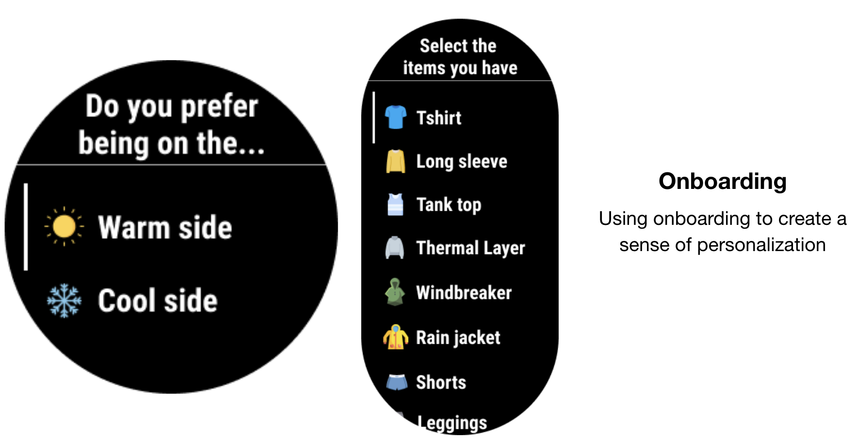
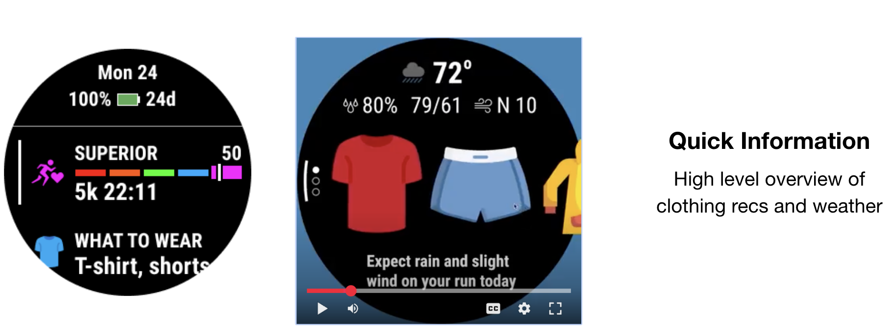
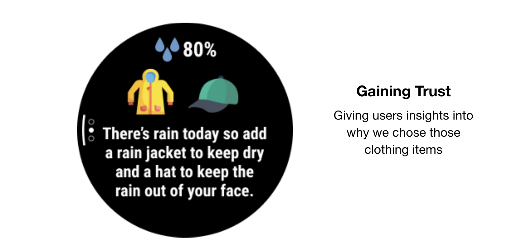
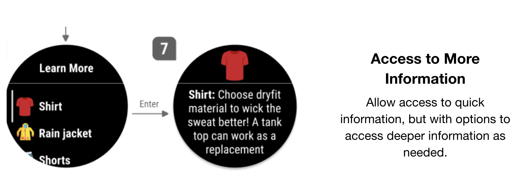
The final experience provides runners with personalized clothing recommendations based on current weather conditions before starting an outdoor activity. Instead of requiring users to check multiple weather sources and mentally translate the forecast into clothing choices, the watch provides a quick recommendation that helps users prepare before heading outside.T he feature was designed to fit naturally within Garmin's existing ecosystem while remaining lightweight, glanceable, and easy to understand on a wearable device.
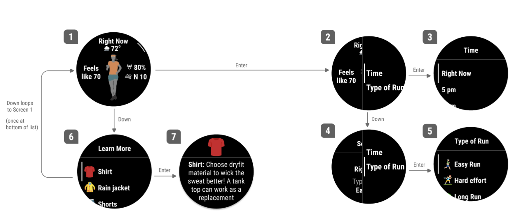
Forerunner 256 Screens
Forerunner 265 User Flow
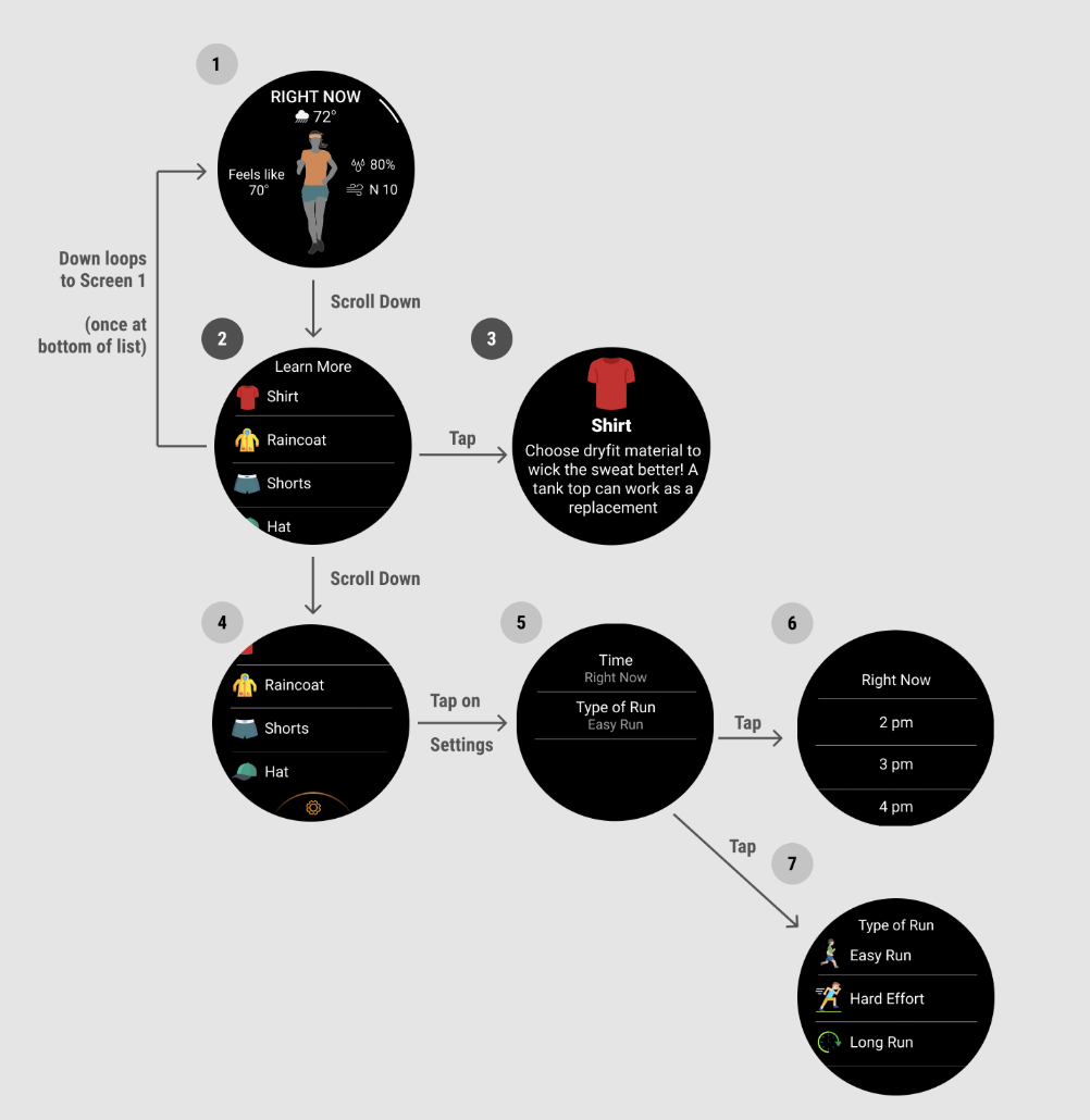
Venu 2s User Flows
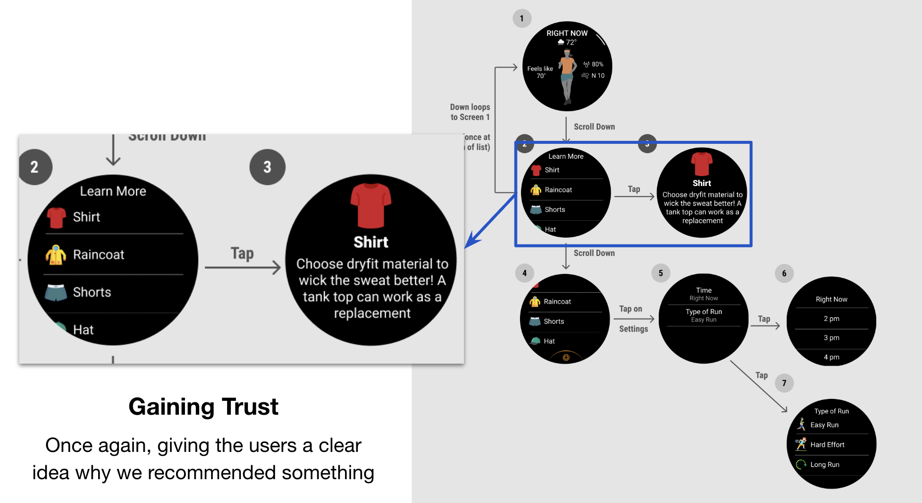
Venu 2s Screens
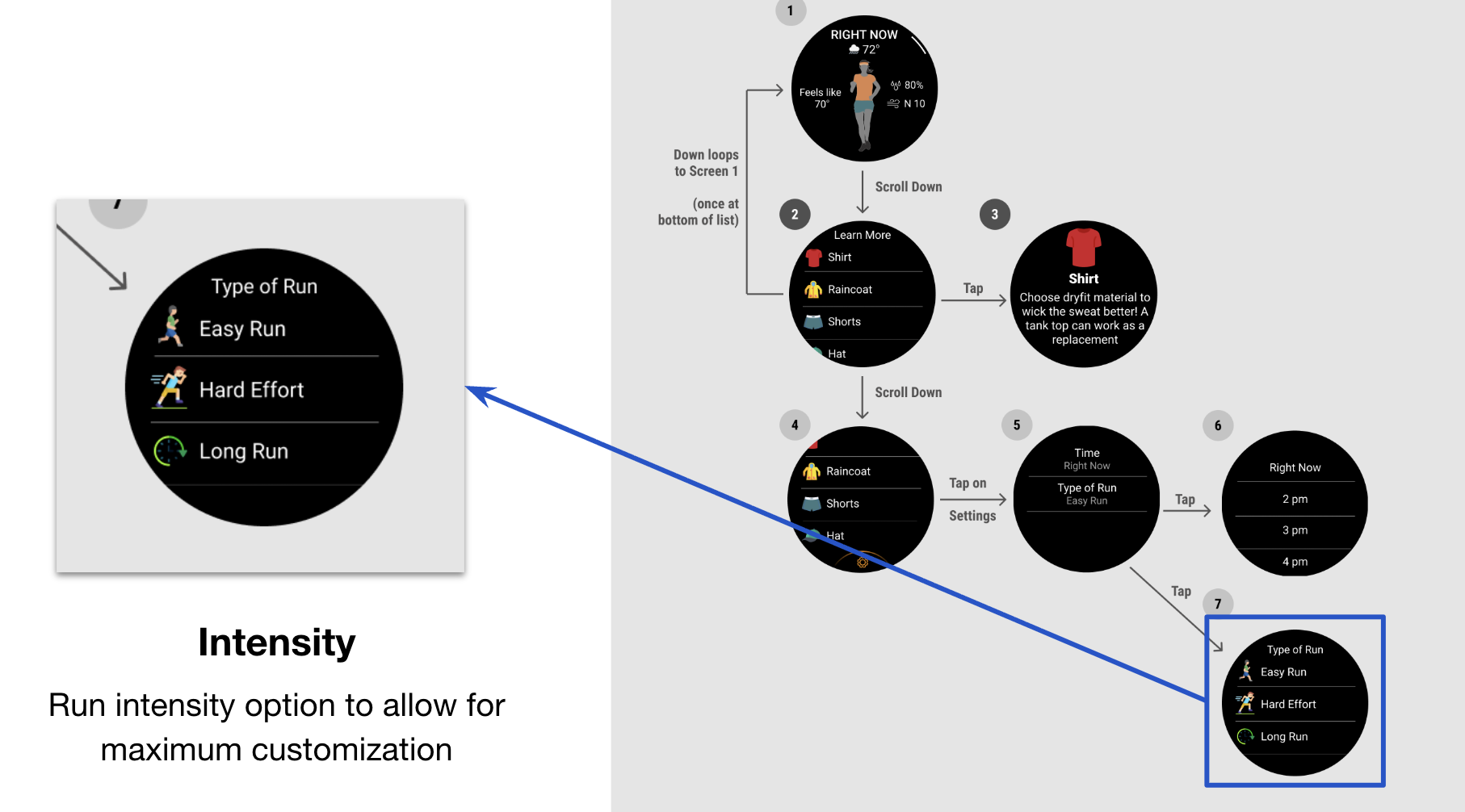
To view a more indepth documentation of this project, scroll through the powerpoint below.
Evaluating and redesigning Garmin's watch face customization experience through competitive analysis and usability research.
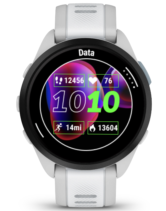
The Garmin Fitness team was exploring improvements to the watch face customization experience for future wearable devices. While the existing editor offered extensive customization, early observations suggested users struggled to understand how the editing process worked.My role was to evaluate the current experience, identify usability issues, and recommend interaction improvements informed by research and industry best practices.
My Role
I independently evaluated the existing experience by combining multiple UX research methods. Responsibilities included: (1) Conducting competitive analysis across Garmin, Apple, Samsung, and Fitbit, (2) Performing heuristic evaluations using Nielsen's usability heuristics, (3), Planning and conducting guerrilla usability testing, (4) Synthesizing findings into design recommendations, (5) Presenting recommendations to the UX team
Research Process
My evaluation combined several research methods to understand both industry standards and user behavior.
Comparative Analysis
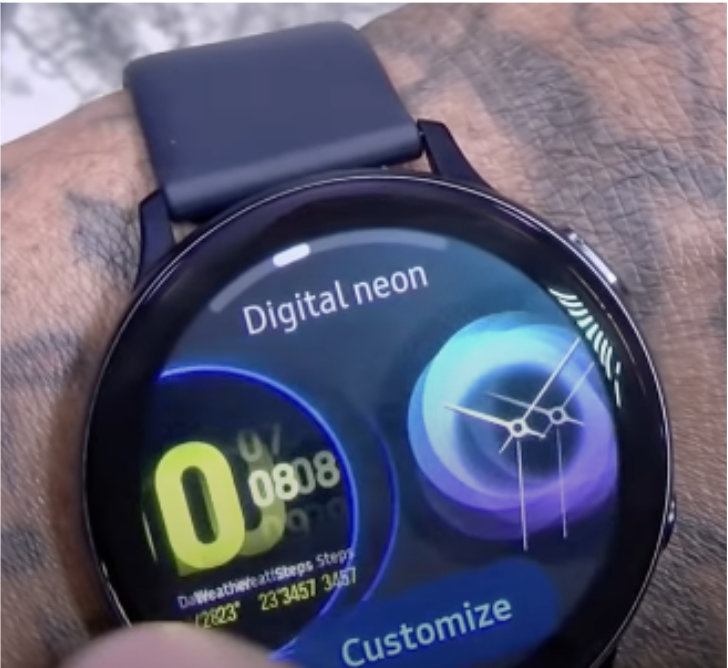
I analyzed smartwatch customization experiences across Garmin, Apple, Samsung, and Fitbit to identify common interaction patterns and emerging best practices. One consistent finding was that competing products clearly communicated when users entered editing mode and provided stronger visual cues throughout the customization process.
The research focused on:
Heuristic Evaluation
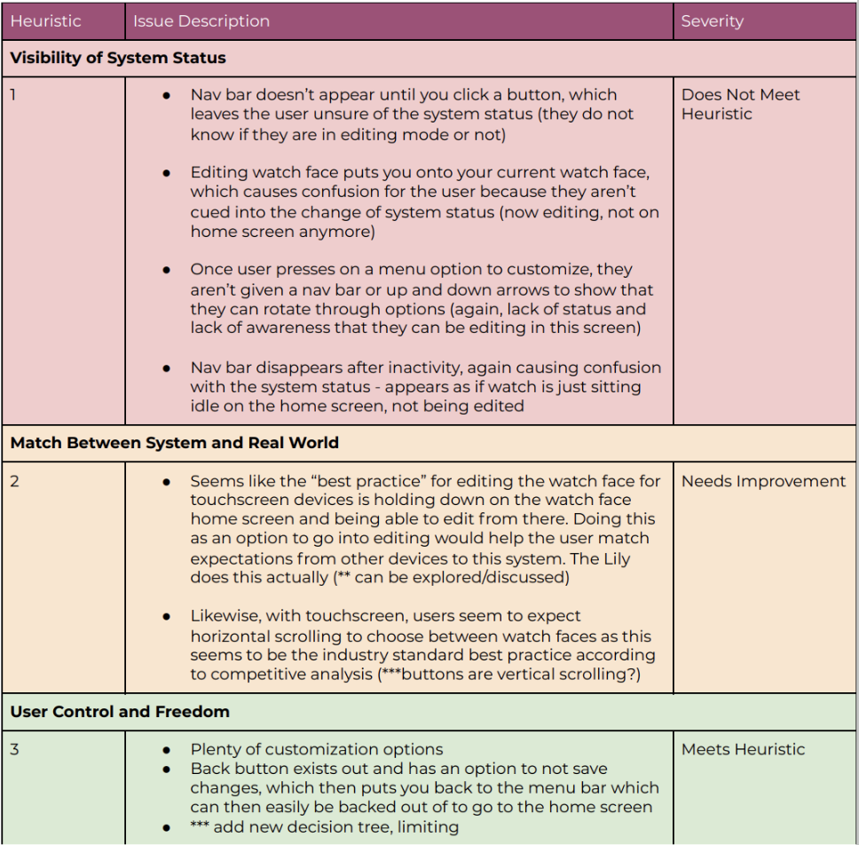
Using Nielsen's usability heuristics, I evaluated Garmin's existing watch face editor and identified several opportunities for improvement. The most significant usability issues included:
Guerrilla User Testing
To validate these findings, I conducted informal usability testing sessions using Garmin watch prototypes.Participants completed realistic customization tasks while explaining their thought process aloud. Testing focused on discovering editing mode, navigating customization options, understanding labels and differentiating button and touch interactions.
Key Research Findings
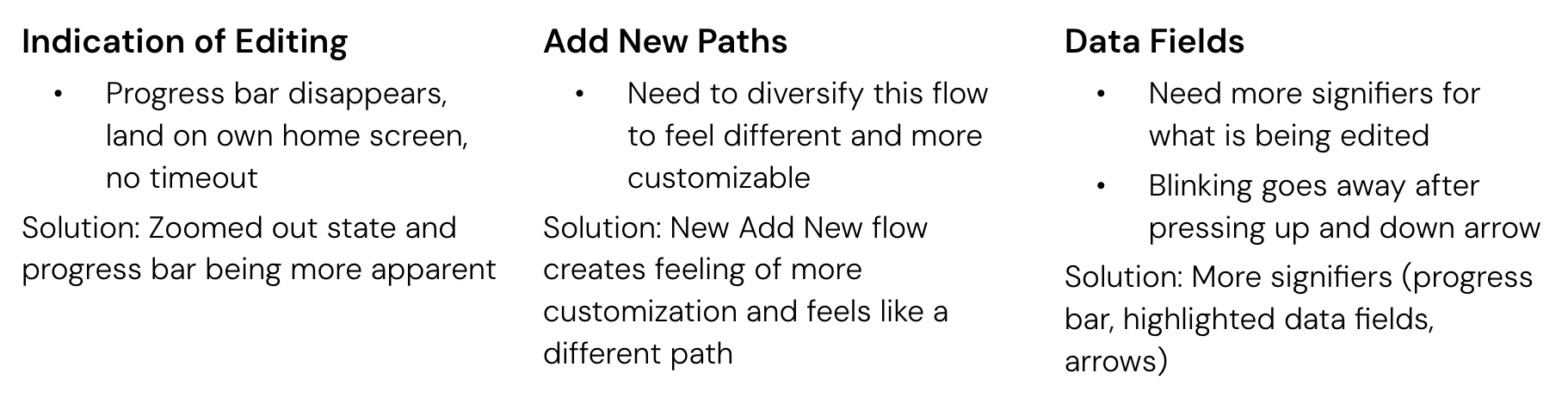
Design Recommendations
Based on the research findings, I proposed several improvements.
Improve visibility of editing mode
Improve interaction affordances
Simplify terminology
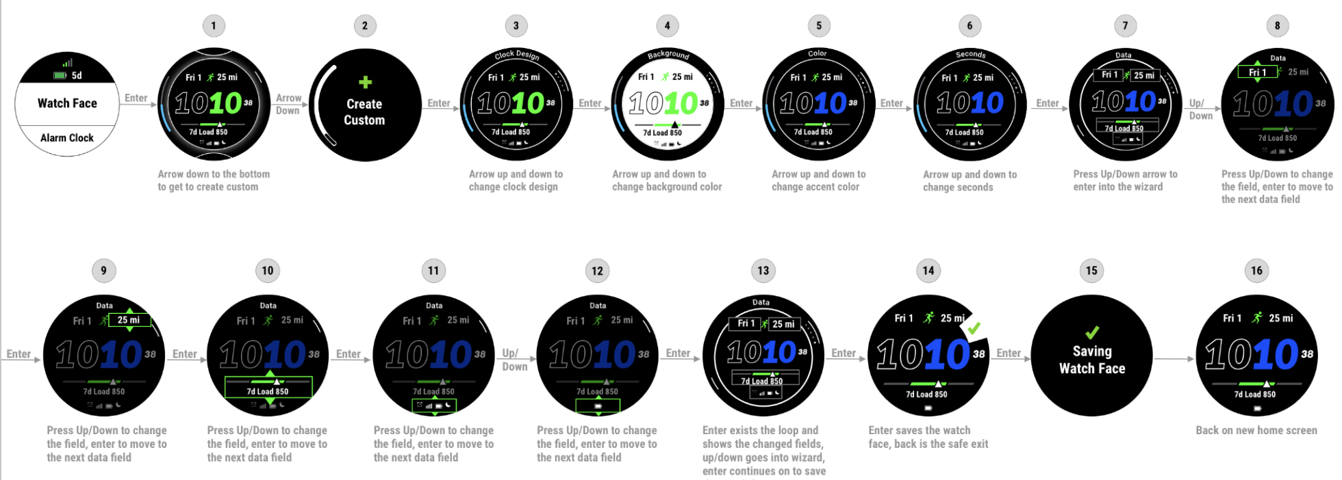
Final Designs
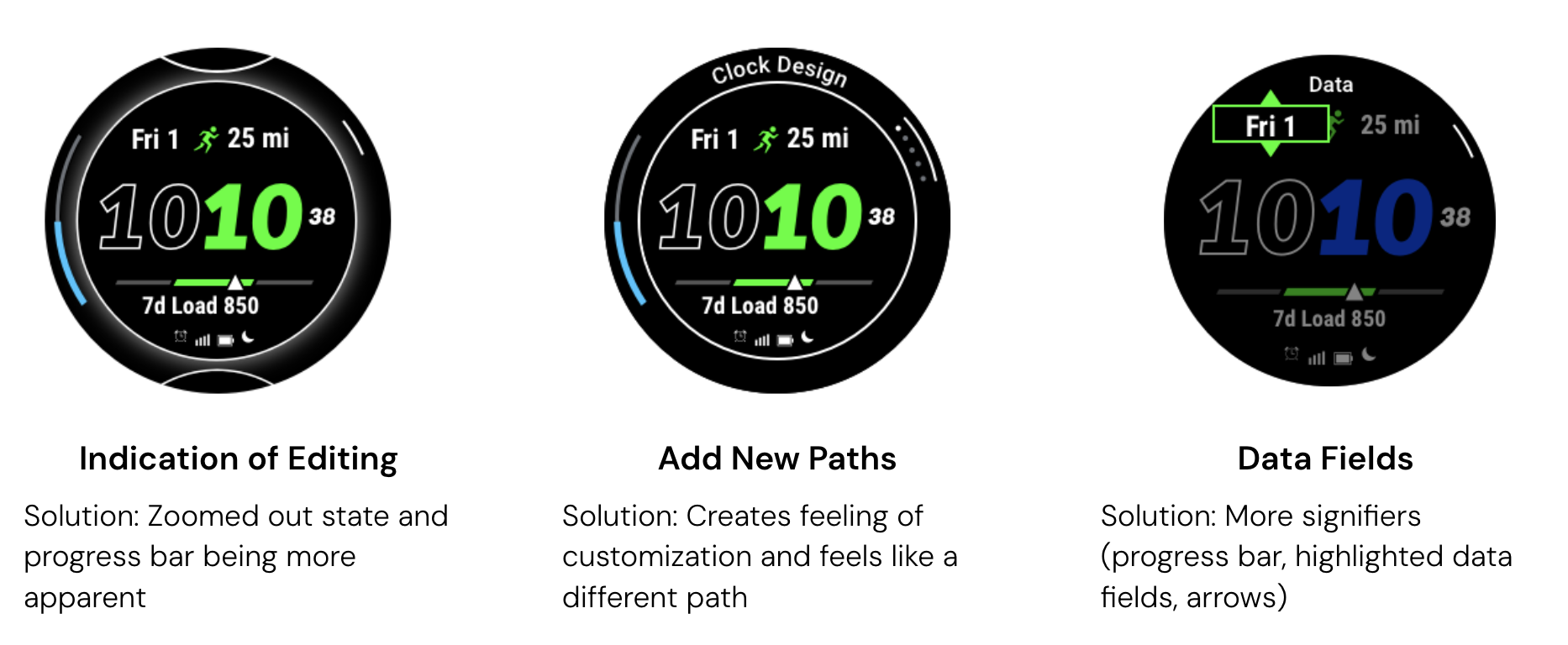
Venu 2s Watch
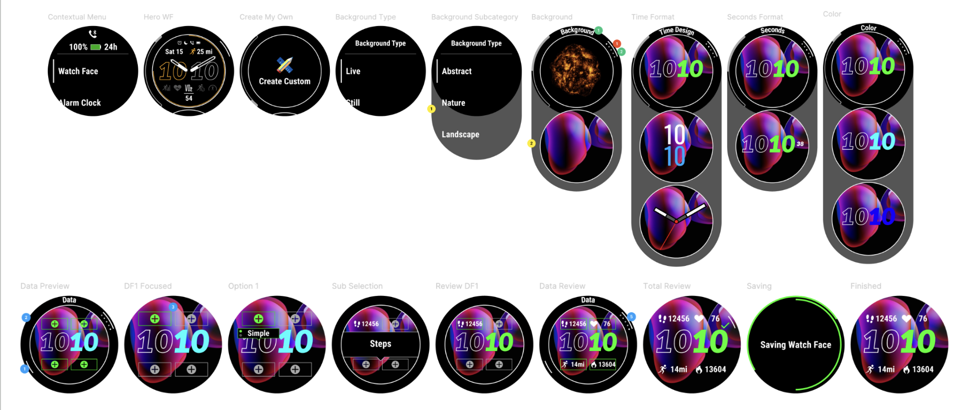
Forerunner 265 Watch
Garmin Clipboard Coaching App: Worked with Garmin's future product development team to prototype coaching workflows, facilitate ideation sessions, and conduct usability testing with athletes and coaches.
Methods: Usability Testing • A/B Testing • Ideation • Prototyping
Garmin Kid's Bounce Testing: Conducted 12 moderated usability sessions with children and parents to evaluate onboarding, communication, navigation, and accessibility for an unreleased wearable product. Synthesized findings into design recommendations for the product team.
Methods: Usability Testing • Affinity Mapping • User Research
Women's Health: Evaluated Garmin's menstrual health experience through competitive analysis, secondary research, and usability evaluations. Developed recommendations for educational content and age-appropriate experiences supporting younger users entering puberty.
Methods: Competitive Analysis • Secondary Research • UX Evaluation
Garmin Connect App Onboarding: Researched and redesigned onboarding and learning flows within Garmin Connect to improve feature discoverability and first-time user adoption.
Methods: User Research • Journey Mapping • Interaction Design
Apps & Activities: Built interactive Flinto prototypes for redesigned Apps & Activities workflows and created usability testing protocols to validate new navigation patterns before development.
Methods: User Research • Journey Mapping • Interaction Design